 Tiffany's current homepage image is the best I've seen in a while. It has exactly everything to do with their subject matter. It totally addresses their audience: women who dream of this moment happening this very way, and men who have no idea how to propose (but this is a good option). It's season-appropriate, and fits in with their overall color scheme. Good work Tiffany's.
Sunday, December 13, 2009
Tiffany & Co: Best Homepage Image in a While
 Tiffany's current homepage image is the best I've seen in a while. It has exactly everything to do with their subject matter. It totally addresses their audience: women who dream of this moment happening this very way, and men who have no idea how to propose (but this is a good option). It's season-appropriate, and fits in with their overall color scheme. Good work Tiffany's.
Friday, December 11, 2009
I love the Logo of this Cupcake Blog

First of all, I love cupcakes. Also, everyone knows I love pink, although this is more of a mauve. Anyway, I love this handwriting font. It's really clever how the C in cupcakes is created as a bite inside the cupcake image. I wonder how people think of this stuff. I like to think I'm creative like this, and people tell me that I am. But I don't feel like I am sometimes. I suppose this program is good for that; it forces you to be, think and act creatively all the time. I just finished some huge projects, and I'm still up at 1:30 am. Class tomorrow is at 9:30. I just don't feel like going to sleep. Unless, I can dream of cupcakes and logos like the one above.
Thursday, December 10, 2009
Friday, November 27, 2009
Wednesday, November 25, 2009
An Old Wallpaper

Hi everyone,
A long time ago I stumbled across Vladstudio.com. It's full of amazing desktop wallpapers. You didn't used to have to register to get the good stuff (well really it's all good). I had this wallpaper downloaded a few years ago. It's called "Butterfly." And boy is it CUTE!
Monday, November 23, 2009
Children's Picture Books
I also think it's very interesting when writer's create e-books, as you saw in my last post. I came across this e-book for kids and although you can purchase it, I think it's really cool to read online with the horizontal scrolling. It's called "An Awesome Book" by Dallas Clayton. This is a book everyone in our class can appreciate. If not for the writing, for the layout and design.
Click to read:

Saturday, November 21, 2009
Chris Craymer:A Genius of Capturing Love
This is one of my favorite and less sexy pictures which I assume is more appropriate for an educational based blog:
 I absolutely love the composition of this picture. The way the girl is looking at the guy makes it seem like he's the only person in the world she would want to be with. It seems they are so in the moment together that there's nowhere else they'd rather be. It's true romantic bliss. The guy, to me is saying, "I love this girl so much that I'll wear daisies around my eyes." At the same time I think this could be the girl's image of their love in her head. That it's beautiful and cute and she would put flowers in their eyes to show their happiness.
I just love this.
Packaging Story Show & Tell: Crayons

How's this for a packaging story? Nothing like some good old fashioned drama.
In B&S, Plaintiff Binney & Smith (B&S) alleged
that Rose Art sought to capitalize on the fame
and recognition of the green and yellow design
used on “Crayola” crayons and markers (the
“Crayola trade dress”) by introducing a line of
children’s markers in packaging incorporating a
similar green and yellow design. In finding that
Rose Art’s use of a similar green and yellow
packaging diluted B&S’ Crayola trade dress, the
court first noted that the Crayola trade dress was
exactly the type of “famous” mark that the FTDA
was designed to protect. The court relied upon
surveys showing that the Crayola trade dress had
acquired national and international recognition
with consumers of children’s products, as well
as other evidence, such as the inclusion of the
Crayola packaging in the Smithsonian
Institution’s permanent collection and its recent use
on a U.S. commemorative stamp.
From www.arnoldporter.com/resources/documents/Consumer_spring_2002.pdf
Wednesday, November 18, 2009
I Made a Twitter

Just click the image for the link.
Monday, November 16, 2009
When Breaking the Rules Works.
Sunday, November 15, 2009
Choosing a font color for my instant messaging system.

I think this is a really cool option for the color palette of my fonts on my instant messaging system. I use adium, as I have mentioned before. I highly recommend it over AIM for macs. It's interesting that the color white is labeled as "snow." Has anyone concept of a crayon box for a color palette before?! It's a screenshot. I think it's so clever.
Saturday, November 14, 2009
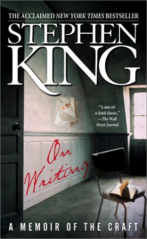
Narrative Show & Tell: Stephen King's On Writing
 Sadly, this book cover doesn't fit in with my blog's theme. But, the content is just too good to miss. Stephen King writes about writing, what could be better? I'm not really a die-hard Stephen King fan, but I know the man can write.
Thursday, November 12, 2009
VS Pink Holiday Home Page
A coffee comic
http://theoatmeal.com/comics/coffee
I have been finding lots of interesting links lately.
http://www.themaninblue.com/experiment/BokehType/
How to Use an Apostrophe Flow Chart
http://apostrophe.me/
Wednesday, November 4, 2009
My Computer
Monday, November 2, 2009
Saturday, October 31, 2009
"Font Conference" : Fonts Personified
http://www.youtube.com/watch?v=i3k5oY9AHHM&feature=PlayList&p=25636C72D21EAA94&playnext=1&playnext_from=PL&index=19
Tuesday, October 27, 2009
New Doc Idea
Sunday, October 25, 2009
Saturday, October 24, 2009
Everybody has to do this!
http://www.fontcapture.com/
Favorite Words Show & Tell
Oxford American Writer's Thesaurus
Apple Dictionary
Wikipedia
Tuesday, October 20, 2009
Cake Boss Commercial
Everyone needs to watch this commercial for Season 2 of Cake Boss. It's really cool because they write comments and reviews about the show on all kinds of cakes. It looks awesome, especially when they cut the knife through one of the cakes.
Wednesday, October 14, 2009
The Runs : Real World v Road Rules Challenge
NYC Findings
Friday, October 9, 2009
Collection Show & Tell: You're really pushing my buttons
 Crystal Cardi Button ^^
 Night on the High Seas Button ^^
 Tutti Fruitti/Bubble Gum Button^^
Here are three buttons from my button collection. They are my favorites. The first one comes from my favorite sweater which I shrunk, RIP teal cropped cardigan. I love how it shines and adds a fancy flare to the air (and maybe one day to its new sweater home).
The second button came as an extra to a navy blue cotton blazer I have, which I only where every so often. So, if you see it on me CONGRATS! I love nautical themes for clothes, rooms, websites, just about anything, as long as it's done right.
The last button fell off of a pink zebra striped cardigan I purchased from Wal-Mart. Believe it or not, that cardi was my favorite for as long as it could be. It ripped in the wash after the 3rd time I wore it...another RIP (haha..ripped RIP..haha). However, this item's demise was not surprising, considering where I purchased it. This button reminds me of bubblegum flavored ice cream I used to get as a kid by this ice cream shop near my old house...ahh childhood.
Wednesday, October 7, 2009
Crystal Light Ad
Monday, October 5, 2009
Geico Pothole
I have posted the Geico pothole advertisement under "my favorites." It is absolutely hilarious, you have to watch it. Let me know what you think!
JKY
Friday, October 2, 2009
Wednesday, September 30, 2009
Photoshop In Real Life--click for full image
Monday, September 28, 2009
The Islands of the Bahamas

I have always enjoyed this logo, since I first saw it on a plane to the Florida Keys. When printed, this logo is much MUCH brighter and the colors are extremely vibrant. The color choice is great, and represents fun, life, and vacation. The abstract shape represents a string of islands. This is so simple, yet very well-thought out. I really like logos, and layouts with varying color schemes. But, this one really makes me happy.
Saturday, September 26, 2009
Definition Show & Tell: Modern Vintage

Today for show and tell, I had ripped out a page from Glamour magazine. It was part of one of those advertisements that actually looks like part of an article. It is describe a fashion trend for Fall 2008 defined as "Modern Vintage." I think the definition of this phrase is trendy, high-end and not overly-adjectival (who knew that was a word?).
Friday, September 25, 2009
What are these things called?
I find this one quite appealing. I think that shades of tan and shades of teal work really well together, and not only for nautical themes. The look of this...whatever it's called.....makes you feel like people have looked at a million times, like it holds all of life's answers. I think it's great. The concept of these things is very simple, all you have to do is say yes or no to certain questions. But, this one in particular looks wise, and soothing. It opens your eyes simply to an often times heavy question.

*click for source
Wednesday, September 23, 2009
Rip Curl Girl's Tour

Sunday, September 13, 2009
Don't Judge a Blog by its Title
In fact, the whole reason I got into this design and writing thing was because I discovered that I don't have to do what everyone else is doing. But, I had to know what everyone else was doing in order to hit that gold mine.
Lastly, I'd like to thank God, and the academy for making my dreams come true


